This is the story of a tower display I worked hard on, that I really liked, that I felt did everything I set out for it to do, but it didn’t work. Failure is hard, but the lessons learned are invaluable: if in the end the idea doesn’t work, let it go. (But maybe write a blog post about it first, to lessen the blow.)
I have written about designing and developing my jewelry display frames here and here. I had one problem left to solve: how to display my frames indoors. Indoor shows are different because I have a smaller space and no tent frame from which to hang my displays .
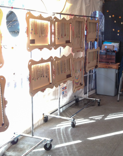
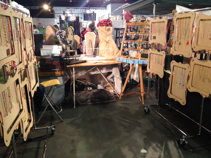
My first solution to this problem was to hang the frames on portable clothing racks. This works great if there is a long, thin space to display them. But for some shows, especially the really crowded ones, this just won’t do. For these shows, you get a very rigid, 6’x6’ or 6’x8’ space, no exceptions, no flexibility.
The clothing racks are a standard 6’ long and 2’ wide and each rack fits half of my frames. The 6’ length is fine, but the problem is the two racks. Either they go parallel to each other, leaving only 2’–4’ in between for customers to browse, or they are arranged in an L-shape or a T-shape leaving dead space in the corners. Those dang corners!
Another option is to have just one rack and hang the frames on both sides of the rack. This is more spacious, but then the rack goes right down the center of the booth. This cuts my booth in half. It’s divisive. It just feels wrong and is not ideal for flow.
I have pretty much done all of the above options, along with experimenting with numerous diagonal ideas, and they are okay. But I thought I could do better.
DESIGN PROBLEM:
Find a way to hang 12 frames (each 2’x1.5’) in a 6’x6’ booth. The customers must feel they have space to browse and not feel cramped or in the way.
The display must be secure and not easily knocked over. In addition, it has to be lightweight and easy to carry and set up.
In short: any display surface must hold 36 square feet of display, be 4’x4′ or less, be compact, strong, portable, and well-supported.
DESIGN SOLUTION:
Instead of racks in lines, I thought maybe a circle in the center of my booth would work better.
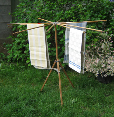
One idea from Etsy was this vintage clothes rack.
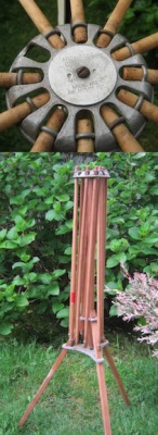
I love this design. I love how it sets up and folds up so effortlessly and creates a huge amount of surface area from almost nothing. I love how you can deploy only as many arms as needed. I love how each arm is 2′ long. I love the old wood look. The top even spins. But I felt it was just too rickety and too, well, old, to really function professionally.
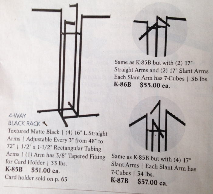
Another idea from a display catalog was these racks with arms radiating out from the center.
Look at that sturdy base! I like the central support idea because the base of the stand does not take up extra booth space, the legs and supports are integral to the design (unlike a wall design—like the linear clothes racks—where the legs/supports extend into the booth and take up 2′ of precious space). With a circle or tower, the geometry of the display supports itself. It’s inherently more stable.
I was just about to order the central display rack from the display company, but it was a little on the short side, and I had two additional concerns: Would it arrive on time? How transportable/foldable is it?
That is when I came up with the third idea: I could build one myself with PVC. For about $20, I could have a strong, portable, display tower that was exactly the height and width I needed. It would take me about one full day to build it (as opposed to a week to order and ship the commercial item).
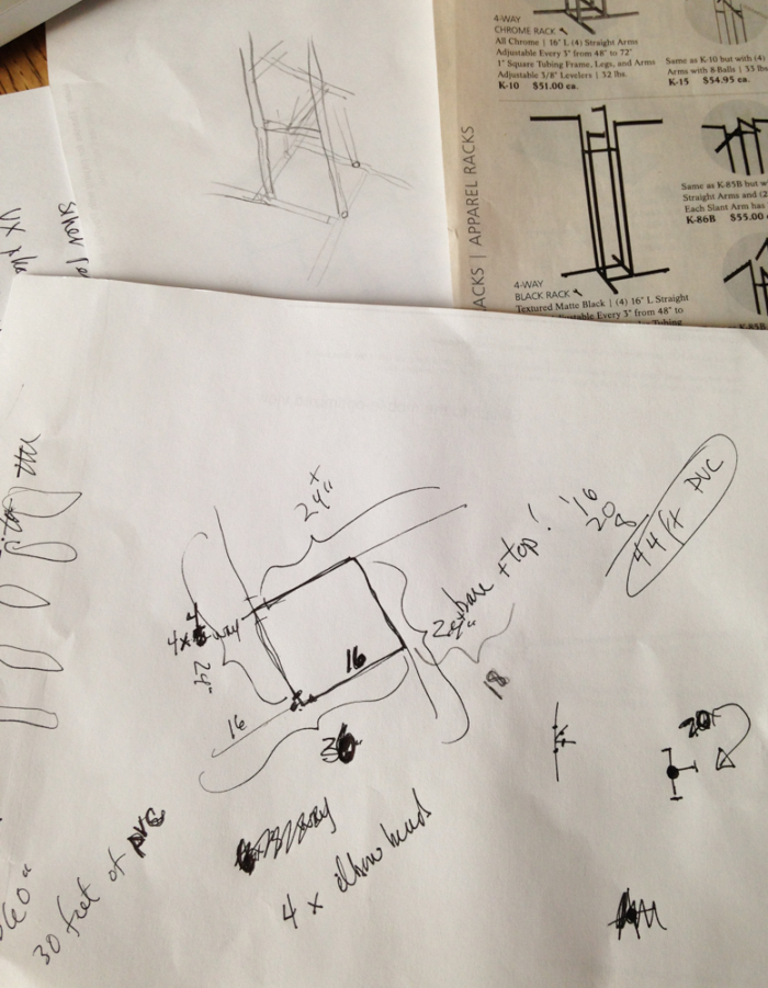
Here are my quick sketches for my display.
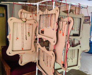
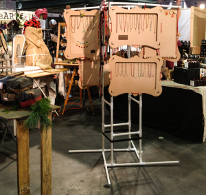
The tower went together quickly and easily (well, except I needed to give it a bit of a twist because only three-way T-joins are available for the corners: I used one T-join to go out, and then, next to it, another T-join to go up. It gave the tower a twist, but it worked!). It was tall and portable and strong. It had 36 square feet (at least!) of display space but, fully deployed, it fit into a 4’x4’ square. And if you set the 4’ dimension on the diagonal of the booth, there was plenty of space.
I loved it!
DESIGN FAIL:
I tried it at home and then took it to my next indoor show. People could walk around the tower and browse each section. I thought maybe the mystery of walking around, seeing what was next would entice people, make them think there was more than there was, give them a sense of exploring and intrigue.
And people did come into my booth and they did walk around the display—and then they walked right out again.
I couldn’t engage them. When they were looking at items on the other side of the tower, I couldn’t comment on what they were seeing. They would come around the tower and then that would be it. They were off.
I was shocked. How could it be? This tower did everything I had hoped it would do, except it was killing my sales. I had this really strong feeling that sales were walking away one after another. People who would normally stop and engage were disconnected.
But maybe it was just a bad show. Could it really be the display?
SALES SUCCESS:
I invariably do worse on the second day of a show (usually because there are fewer hours and attendance is lower on Sundays). After a mediocre Saturday with the new display, I figured I had nothing to lose. I returned on Sunday with the tried and true linear clothes racks, one on each side of my booth. Boring. But I was able to connect with my customers again, they could see the options laid out before them, and they bought more on the second day than on the first. As much as I’m loathe to admit it, I believe the difference was in the display.
While the tower worked from an engineering perspective, it was a failure from a sales perspective. I’m glad I listened to my convictions and ditched the new display. As proud of it as I am, it just didn’t do the job.
Anybody need a PVC tower?
And now I’m thinking about a custom PVC L-shaped rack, with a diagonal corner…hmmm…
I love how you just keep experimenting and trying things out. There’s no way that you could have anticipated how the displays would do until you actually built them and gave them a test run – now you know of another variable to consider!
Still looked pretty elegant, though!
Good point, Lisa. Trying is what it is all about. I fear failure a lot less these days…the more I try. The process is what keeps me going!